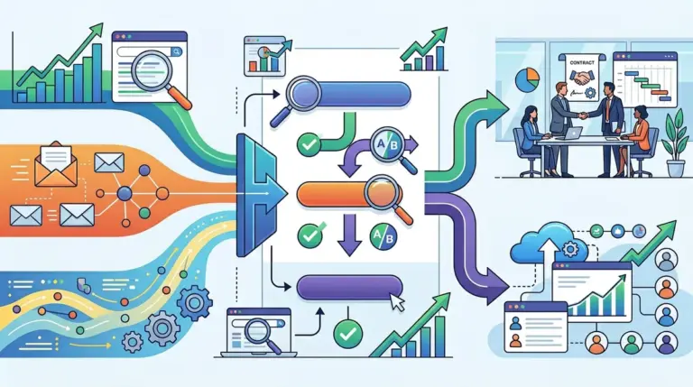


The standard marketing playbook suggests that reducing form fields is the fastest way to increase conversion rates. While technically true—every field removed typically yields a measurable lift in submissions—it often creates a downstream disaster for sales teams. A form with three fields might generate 500 leads, but if 400 of them are unqualified, the cost of manual triaging outweighs the benefit of the volume. Improving form conversion rates without sacrificing lead quality requires a shift from "reducing friction" to "optimizing friction." This focus on optimizing friction for better results is a core tenet of conversion rate optimization basics for marketers.
Implementing Progressive Disclosure via Multi-Step Layouts
Single-page forms with twelve fields are visually overwhelming and trigger immediate cognitive load. However, asking only for an email address often leaves you with a database of anonymous leads. The solution is progressive disclosure: breaking the form into logical, multi-step sequences. This utilizes the "sunk cost" effect; once a user commits to the first two easy questions, they are statistically more likely to finish the more intrusive ones.
Best for: High-ticket B2B services and complex SaaS products where qualifying data like budget or company size is non-negotiable.
To execute this effectively, the first step should contain low-friction, non-identifiable questions. For example, ask about the user’s primary challenge or their industry before asking for a phone number. This builds momentum. By the time the user reaches the "hard" fields, they have already invested 30 seconds into the process. Data from lead-gen experiments consistently shows that multi-step forms can increase conversion rates by up to 30% while allowing you to keep—or even increase—the total number of qualifying questions.
Using Conditional Logic to Filter Noise
Not every visitor needs to answer every question. Static forms are inefficient because they treat a "Student" the same as a "VP of Marketing." Using conditional logic allows you to show or hide fields based on previous answers, ensuring that only high-intent users are prompted for deep-funnel information.
- Branching paths: If a user selects "Company Size: 1-10," you might skip the budget question. If they select "500+," you trigger a field asking about their current tech stack.
- Lead Routing: Use conditional logic to send high-value leads directly to a calendar booking page (like Calendly or Chili Piper) while sending smaller leads to a standard "Thank You" page.
- Spam Prevention: Conditional logic can also act as a soft gate. If a user selects an option that indicates they are not a fit (e.g., "I am looking for a job"), the form can terminate early with a polite redirection, saving your CRM from bloat.
Pro Tip: Never use a "Clear" or "Reset" button. There is zero commercial benefit to helping a user accidentally delete their data. Replace that visual space with a micro-testimonial or a security badge to reinforce trust at the point of friction.
Leveraging Third-Party Data Enrichment
The most effective way to keep forms short while gathering deep data is to stop asking the user for information you can find elsewhere. Data enrichment tools allow you to collect a single data point—usually a professional email address—and automatically populate your CRM with the user’s job title, company revenue, headquarters location, and tech stack.
By integrating enrichment at the form level, you can reduce a seven-field form to just three: Name, Work Email, and Primary Goal. The backend handles the rest. This preserves the high conversion rate of a short form while providing the sales team with the granular detail required for high-quality outreach. If you are targeting enterprise accounts, this is the single most impactful technical change you can make to your lead flow.
Refining Micro-Copy and Validation Errors
Vague labels and aggressive error messages are silent conversion killers. If a user enters a phone number and the form rejects it because of a missing dash, but doesn't explain why, they will likely abandon the page. Real-time inline validation is essential. It provides a green checkmark as the user completes a field correctly, providing positive reinforcement.
The "Submit" button itself is often overlooked. Generic text like "Submit" or "Send" feels like a chore. Instead, use benefit-oriented language that mirrors the offer. If you are offering a whitepaper, use "Get the Report." If you are offering a consultation, use "Schedule My Audit." This small change keeps the focus on the value received rather than the data given.
Optimizing for Mobile Input Types
A significant portion of B2B traffic now originates on mobile devices, yet many forms are still optimized for desktop browsers. This creates physical friction. Ensure your HTML uses the correct "inputmode" attributes. When a user clicks a phone number field, the numeric keypad should automatically appear. When they click an email field, the "@" symbol should be visible on the primary keyboard layout.
Furthermore, eliminate dropdown menus for options with fewer than four choices. On mobile, a dropdown requires multiple taps to see and select an option. Use radio buttons or "tappable tiles" instead. These are easier to interact with on a touch screen and reduce the time to completion by several seconds.
Validating Lead Quality with Honeypots and Verification
High conversion rates are meaningless if your database is filled with "test@TLSubmit" or bot submissions. To maintain quality without adding the friction of a CAPTCHA (which is known to tank conversion rates), use a "honeypot" field. This is a hidden form field that humans cannot see, but bots will automatically fill out. If the hidden field contains data, the submission is discarded.
For human-driven low-quality leads, implement real-time email verification. This prevents users from submitting misspelled or fake domains. By alerting the user that their email looks incorrect before they hit submit, you ensure that every lead reaching your sales team is reachable.
Audit and Iteration Framework
Improving form performance is not a one-time event; it is a cycle of testing and refining. Start by auditing your current "drop-off" points using heatmaps or form analytics tools. If 60% of users abandon the form at the "Phone Number" field, that is your primary bottleneck. You must then decide: is the phone number worth a 60% loss in volume? If yes, move it to a second step. If no, remove it and rely on email follow-up.
Monitor your "Lead-to-Opportunity" ratio alongside your "Form Conversion Rate." If your conversion rate goes up but your opportunity rate goes down, you have likely removed too much friction. The goal is a balanced ecosystem where the form is easy enough to complete for a qualified buyer, but rigorous enough to deter the window shoppers.
Frequently Asked Questions
Should I use a CAPTCHA to stop spam?
Standard CAPTCHAs significantly hurt conversion rates. Use invisible alternatives like Google reCAPTCHA v3 or a hidden "honeypot" field. These methods block bots without requiring any effort from your legitimate users.
Is a single-step or multi-step form better?
For forms with more than five fields, multi-step layouts almost always outperform single-step versions. They reduce visual overwhelm and use the "sunk cost" psychological principle to encourage completion.
How many fields is too many?
There is no universal number. The "correct" amount of fields is the minimum required for your sales team to effectively follow up. If you can use data enrichment to gather info behind the scenes, fewer fields are always better for conversion.
Does button color actually matter?
The specific color matters less than the contrast. The button must stand out from the rest of the page design. Use a high-contrast color that hasn't been used for other non-clickable elements on the page.